Using stencils
Welcome to the first installment of a series of Blender stencil tutorials. In this first tutorial we’ll do some basic, straightforward blending using a simple model and a gradient alpha map. At the end I will enhance the things we did to show you another use of stencils. In the next part I intend to show how Cyan uses stenciling to blend terrain. But let me explain the principles of stencils first.
Actually it’s pretty simple. What a blender stencil does is use a black-and-white or alpha image to decide which part of a texture to show and which to hide. By combining two textures seperated by a stencil you can have parts of both appear at will. Have a look at the stack of textures below for instance and the effect of the stencil image on the end result:
I bet you don’t need much imagination to see the implications of this being available to us in the plugin. Cyan uses stencils a lot to do simple blends between terrain textures. If you’ve ever studied Relto and the way blends are done there, then you know what I’m talking about. I must admit that I haven't found many other uses of stencils in Cyan's ages. Most of their textures are stunning in their own right.
Starting with a simple model
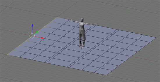
Okay, here is our model (I have a copy of Yeesha as an import file to check dimensions). The model already has its bounds set, and I already have a link in point in place. I also set the default background color in the .fni file to blue. I said it was a simple model didn’t I ;) ?
What I want to do is have a patch of grass on one side and stone on the other. I assume you know how to do UV mapping, so I will skip that part. Later on however I will show you how to use more UV maps on one model. For our little exercise I use one UV map for all layers we'll be using. The default UV map is called UVTex. Since our little patch of terrain is flat I simply choose Project from view to unwrap. I admit, my little age won't be the prettiest. I will be using the following textures:
Notice that I use a very small alpha blend image. Since there isn't much detail in it, there is no point in making it to big. This is actually the actual size, while I downsized the other textures for this tutorial.
Now have a look at the settings for each texture layer. There is nothing new to the settings of the actual textures (grass and stone). You can use the settings you are used to here. The real magic is performed by the middle layer, the AlphaBlend layer.
So here are the settings in Blender. First the grass texture. I won't show the stone texture here, since the settings are the same:
Settings for the stencil layer:
Three important things here:
1. Deselect the "col" button
2. Select the "Stencil" (you must have seen this coming ;) )
3. Select the "No RGB" button
If you are using one of Blenders (procedural) textures as a stencil (for instance the blend textures) then the No RGB button can be left alone.
Let's check how Plasma is doing
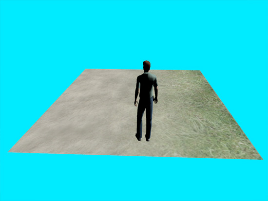
Export your age and pay it a little visit! Have a look at the picture below and you will see that we did all right.
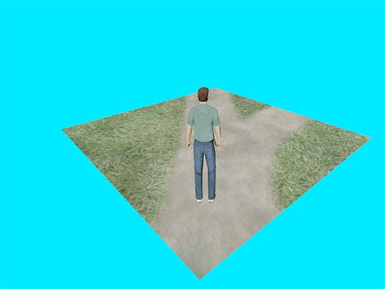
To show you one of the many uses of stenciling look what happens if I change the basic lineair blend stencil for something (only a little) more exciting:
The map I used looks like this:
There are many tutorials online showing how to use these kinde stencils to do some cool blending. Cyan however does not use large blend maps. In many cases they use small lineair alpha maps to blend textures. I'll show how this works in another tutorial.
Another use of stencils
To make our age a little more DRC proof I've decided to put a wall at one end (let's not talk about the dangers on the other three sides). I changed the tiling of the grass a bit giving it it's own UV map. What I want to show you do is a way to make the tiling of textures less obvious.
We all know that we have to stay away from patterns that are obviously repetitive. But then again... details make textures so much interesting. A way to add detail is to combine textures and give them another "rythm". Layering textures that are both 512px wide will have the same details fall in the same place each time. But if one of the textures is stretched to 150%, then the repetition will only occure less.
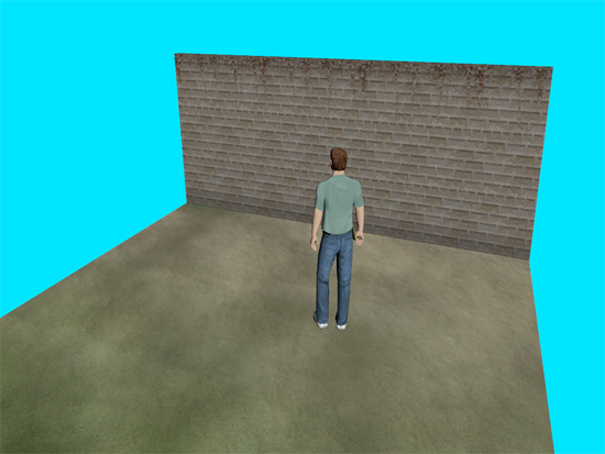
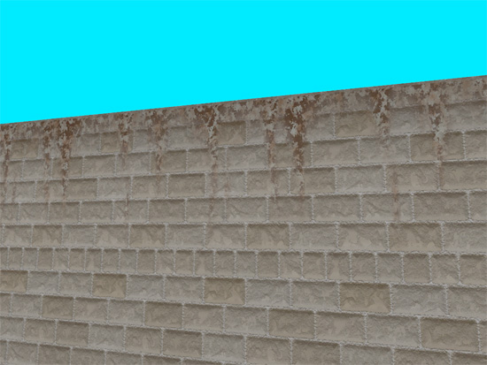
Our new erected wall shows this principle. Again I used three layers. This time the stencil is a drippy kinda map. Intended to mask a rust texture. The effect I'm after is to have some rusty patches at the top of the wall. Have a look at the textures we will use here.
And here is the endresult. Ok, I know, it can be done much better, but to show how this technique can be used effectively this should do.
I have not seen this use of stencils in Cyan's ages. I don't know why. In most cased I think they manage to design textures that are so incredible that in the end they get away with them without us being distracted by their repetiveness. Which maybe is a good lesson here too. Stencils give a whole new range of posibilities, but always think about other (maybe more efficient) options too.


