Difference between revisions of "Adding Atmosphere"
m (Adding atmosphere moved to Adding Atmosphere: Spelling change) |
(→Positioning) |
||
| Line 89: | Line 89: | ||
Note how it now looks a lot more like the view from an island, with a plane of water and sky above it...<br/> | Note how it now looks a lot more like the view from an island, with a plane of water and sky above it...<br/> | ||
The bottom water part doesn't look too good at the moment, but suprisingly, that's not much of a problem in practice. | The bottom water part doesn't look too good at the moment, but suprisingly, that's not much of a problem in practice. | ||
| + | |||
| + | === Texturing === | ||
| + | By now you know the drill:<br/> | ||
| + | Add a material, and add an image texture containing the Sky image, to finish it up. | ||
=== Positioning === | === Positioning === | ||
| Line 101: | Line 105: | ||
In this case, the light-source was already at the correct height as well, but in your case, you should probably move it a bit to get it at the correct height. | In this case, the light-source was already at the correct height as well, but in your case, you should probably move it a bit to get it at the correct height. | ||
| − | |||
== Simulating diffuse light == | == Simulating diffuse light == | ||
Revision as of 16:34, 30 January 2008
Contents
Sky Dome
Having your age surrounded by black makes it look eerie and unreal. So we'd better simulate some atmosphere
For the atmosphere we will use a sky dome, an area surrounding your age that has a texture of a sky on it, so the player will get the illusion of a sky.
For the sky dome, we will use this image:
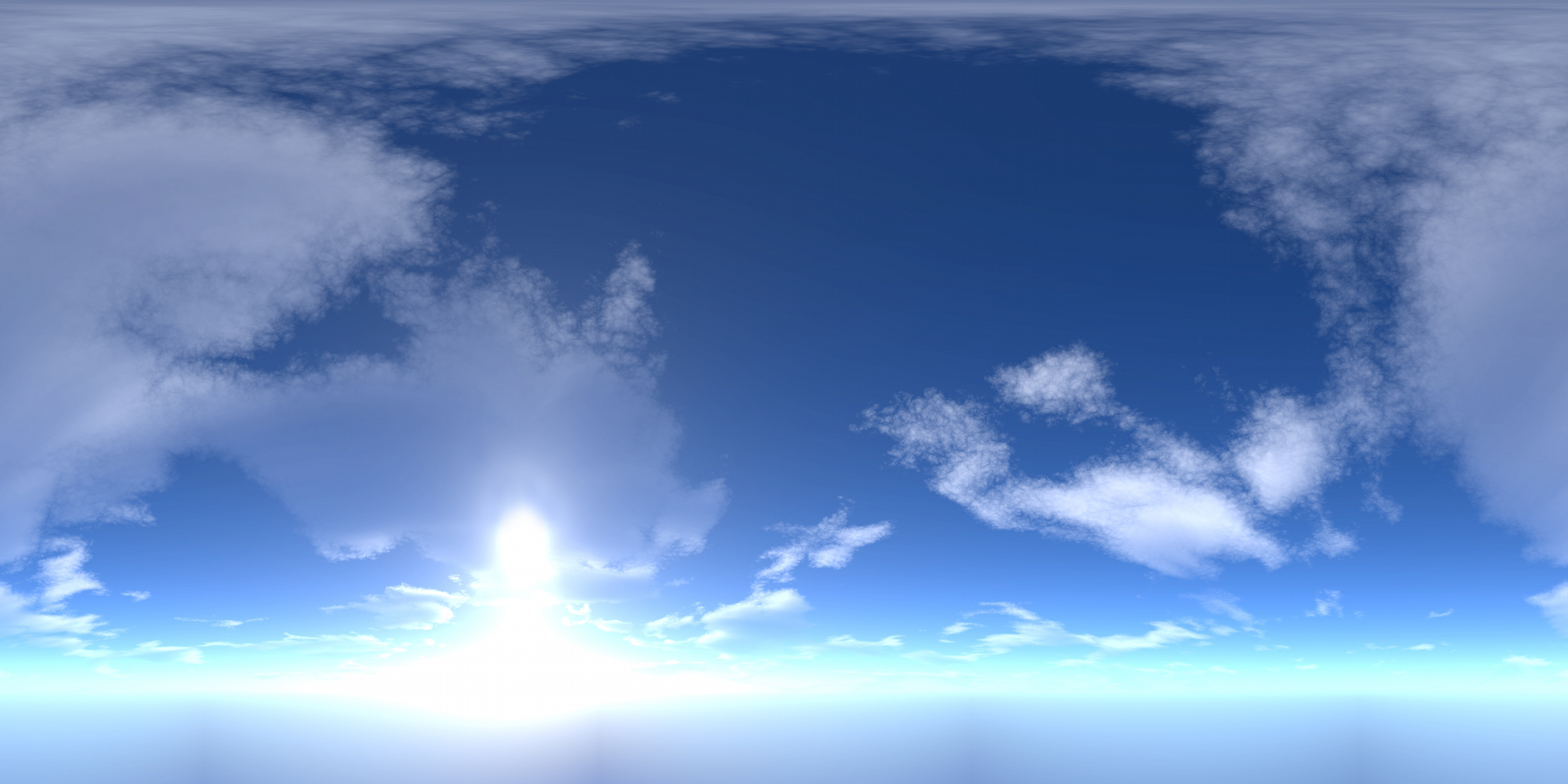 (The image is made by M@dcow, and downloaded from here, it's free to use in any way, so I modified it a bit for our purposes)
Now, this texture is a bit large, but well, it has to encompass the entire view, so it probably should be large.
Modeling
Our sky dome will be based on a sphere, surrounding the island.
Place the 3D Cursor on the center of the island, go into Top view and center ([C]).
Now, add a sphere ([Space]->Add->Mesh->UVSphere).
You don't need to make it very detailed, about 16 Segments and 32 Rings should suffice.
After the sphere is created, flip the normals if needed, so that they point inwards
One sure way to do it is pressing Ctrl-Shift-[N] to recalculate the inside.
Now, scale up the sphere, so make it encompass your island bigtime.
Preliminary UV-Mapping
Now, we're going to map the sphere.
Go to Top view, and center on the Sphere (select it and press Numpad-[.])
Go into UV edit mode, and select all faces.
Press [U] to select an automatic mapping, and choose Sphere from view
Now, don't forget to select the sky image in the UV/Image editor
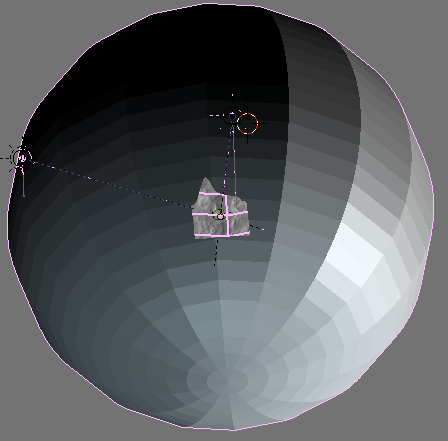
When you're done, it should look like this (with the view adjusted ofcourse):
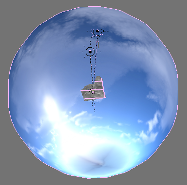
Notice how the sun and cloudes don't line out nicely with what you'd expect...
This won't do, so we must adjust out model again.
Back to the Model
The sphere shape obviously doesn't really work as an acceptable model of the sky. Mostly this is because the sky - as we perceive it from a surface point isn't a sphere, but more like half of a sphere...
So, we're going to change it - no, not simply chop off the bottom, we're going to make the bottom flat.
We will start by cutting off part of the mesh.
Go into Side view and enter Edit mode.
Now, select most of the vertices on the bottom half, but leave three rings below the "equator" of the sphere unselected.
Press [Del] to delete the vertices you just selected.
Next, select the lower row of vertices, and go into scaling mode (press [S]).
Now, manually type in 0.0 to join the vertices into one spot
After doing that, move the set of vertices up by about half the distance between rings.
Now select the two rings above them one ring at a time, and shrink them a little, so that you get a nice approximation of a curve.
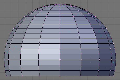
It should look like this now:
Image:Tutorial SkySphere4.png
Properly UVmapping it
Now, if you exit editmode, the sky still won't seem right - we'll need to UV-map it a little more. Go to UV edit mode ([F]), and select all faces.
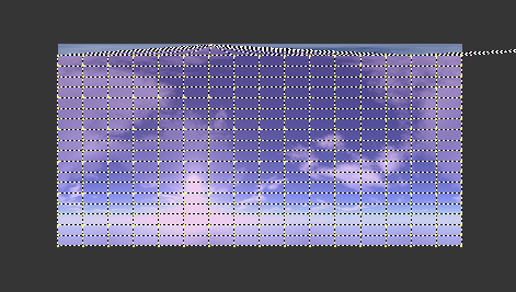
The image in the UV/Image Editor should look like this:
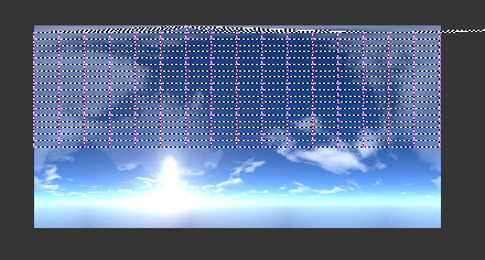
Now, in the UV/Image Editor select all vertices, and scale and move them in the Y direction (you can do that by pressing [Y] during scale or move), so that it covers all of the image.
Take care to map it precisely - especially on the top!
For a nice result, you don't want to have the top vertex be higher than the image bounds, but also not too much lower than the top of the image. Use the scroll wheel on your mouse to zoom in.
On the bottom, you can be a little more lenient.
Now that you're done, it looks a lot better, if you look at it in Texture view:
Image:Tutorial SkyDomeCorrect.png
Note how it now looks a lot more like the view from an island, with a plane of water and sky above it...
The bottom water part doesn't look too good at the moment, but suprisingly, that's not much of a problem in practice.
Texturing
By now you know the drill:
Add a material, and add an image texture containing the Sky image, to finish it up.
Positioning
Now, you probably noticed in the picture above that the sun in the SkyDome texture doesn't match up with the actual light-source that is supposed to be the sun.
We'd better change that, by either rotating the SkyDome, or placing the map different.
You can do either, but in this case it's easier to rotate the SkyDome.
Just select the skydome, and rotate it along the Z-Axis (press [Z] while rotating), so that it matches up nicely:
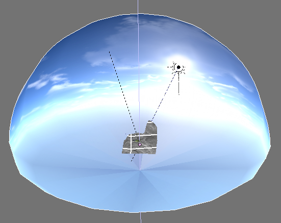
In this case, the light-source was already at the correct height as well, but in your case, you should probably move it a bit to get it at the correct height.
Simulating diffuse light
In real life, we have all sorts of diffuse light that comes onto us (or any object) wherever we are. So even in direct sunlight, we aren't black on the backside.
In a 3D simulation this isn't the case. To simulate this effect, we'll need to add one or two weak light sources that affect us.
The first one:
Duplicate the sun, and move it so it shines almost right down onto of the island. Do offset it a little to the side (not towards the "real" sun ofcourse) so that it lights the parts on your avatar that aren't normally lit.
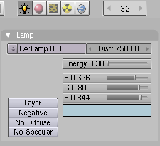
Go to the light properties, and set its power to about 0.35 or 0.40.
As it is to simulate a blue sky, also give it a light blue color:
The second one:
Duplicate the light you just made, and move it to below the island, as this one will light the places that the other one doesn't reach.
From the top view, also move it to the other side as the two other lights, so the distribution will be a bit more evenly.
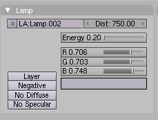
Go to it's light properties, and set it to be another bit darker, more like 0.25, and change its color to a more greyish hue, as it simulates light that is reflected from the island itself.
If the placement of the lights looks like this, you're done:
Image:Tutorial SkyLightPlacement.png
Continue
We're now almost ready to revisit our age. But first, let's get something ready to play with...
How about Taking A Beach Ball With You?

